Article: How and Why We Developed the LUNØR
How and Why We Developed the LUNØR
There is a particular quality of darkness in the Nordic winter that is difficult to describe to someone who hasn't experienced it. It isn't the heavy, oppressive dark of a windowless room. It is vast and textured, filled with gradients of deep blue, lit softly from above. On clear nights, the moon doesn't just hang there. It navigates. It marks time. It gives you something to hold onto.
That feeling is where our idea of the new LUNØR began.

The problem with most moon phase watches
Moon phase complications have existed for centuries. They are one of watchmaking's most romantic functions, a mechanical attempt to map the sky onto a dial. But most moon phase watches do the same thing: they show you the moon, and they leave everything around it empty.
A black disc. Two moons: one visible, one waiting. The space between them untouched.

We looked at that space and thought: the Nordic night is never empty. On any given evening, the sky between lunar cycles is alive — with stars, with atmosphere, with the slow movement of light that Nordic people have watched and navigated by for centuries. The most spectacular of those phenomena, the aurora borealis, turns the dark sky into something electric and alive.

Why not show that?
Filling the night sky
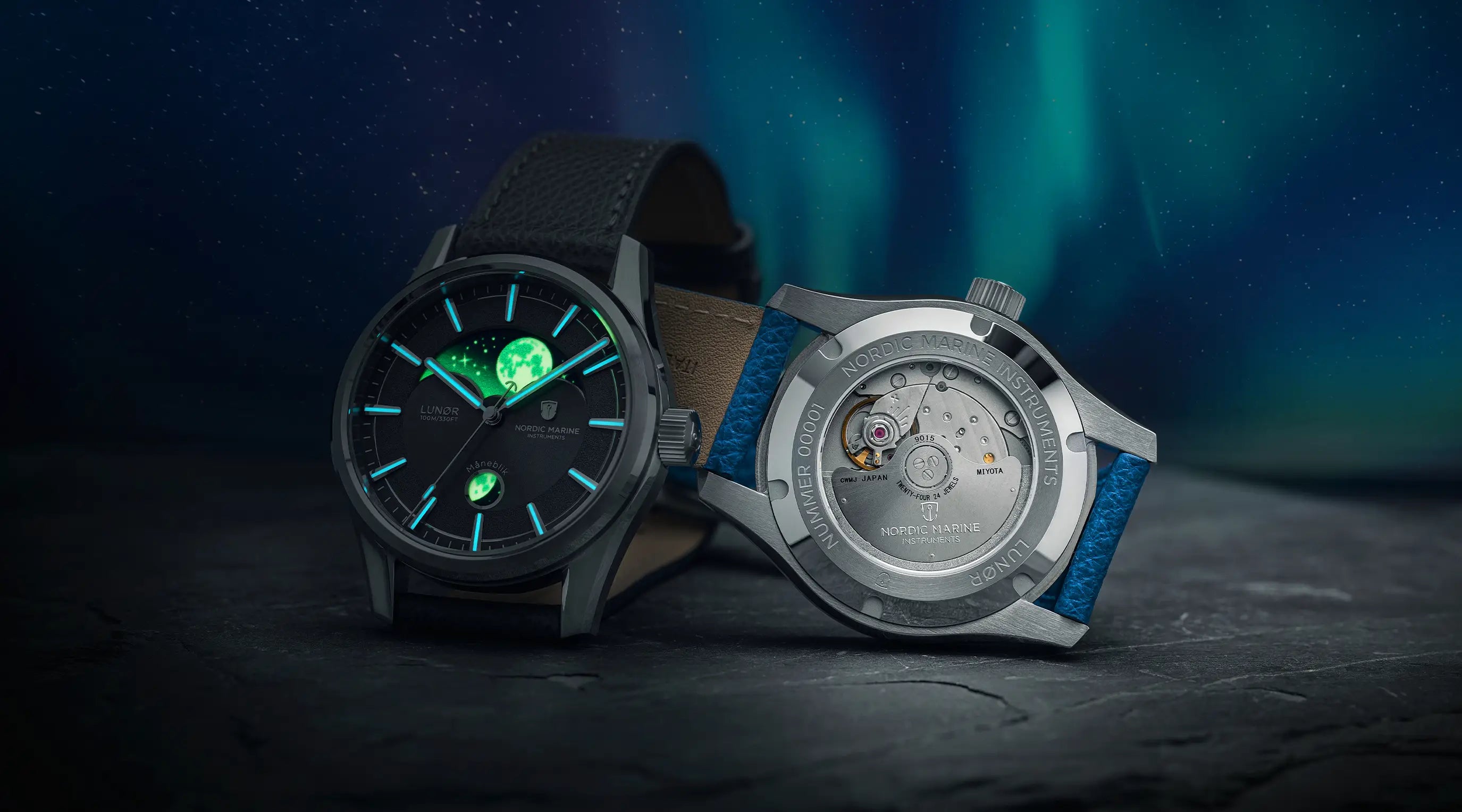
The LUNØR double moon phase disc is designed so that when one moon fades and the other is yet to rise, the space between them transforms into a softly glowing aurora — rendered in green Super-LumiNova C3.
 It wasn't a simple decision. We spent considerable time on what that aurora should look like. Too literal and it becomes an illustration. Too abstract and it loses meaning. What we settled on is impressionistic — a horizon of light that shifts as the disc rotates, suggesting the phenomenon without trying to reproduce it exactly. In daylight, it reads as texture and pattern. In darkness, it comes alive.

The moon discs themselves glow in the same Super-LumiNova, and the applied indices and hands are finished in blue BGW9 — a cooler, deeper light than the green. In darkness, you have two colours of light working in layers. It is, as one reviewer put it, genuinely unlike anything else at this price point.
The detail we call Måneblik
The main moon phase aperture dominates the upper half of the dial. But there is a second, smaller opening, a focused window into the same rotating disc, showing the moon in closer detail. We call this the Måneblik: a Danish compound word combining måne (moon) and blik (a glance, or a view). Both create the view on the moon from the northern- and southern hemisphere.

It does two things. Practically, it gives you a more precise read on where in the lunar cycle you are. Aesthetically, it adds depth to the dial, a sense that you are looking through layers, not just at a surface. The 39mm case and flat sapphire crystal keep things clean and uncluttered, but the Måneblik gives the eye somewhere to rest.
The movement choice
Inside LUNØR beats the Miyota 9015 — a Japanese automatic caliber we chose carefully and deliberately. At 28,800 vph with hacking seconds and hand-winding capability, it is one of the most reliable movements in independent watchmaking at our price point. Its slim profile keeps the case proportions right.

But we didn't use it off the shelf. We modified the moon phase driving wheel to a custom 59-tooth gear, which accurately simulates the 29.5-day lunar cycle. The standard Miyota wheel introduces a small drift over time. Ours doesn't. The moon stays true.
Why 39mm
We are sometimes asked why we didn't go larger. The honest answer is that 39mm is the right size for this watch. LUNØR is built around the dial, not the case. The moon phase needs to breathe, it needs space proportioned to let both the aurora and the moon read clearly without crowding. At 39mm with a 48mm lug-to-lug, it wears slim and close to the wrist.
It is also, simply, a size that works for almost everyone — and we wanted LUNØR to be worn, not kept.
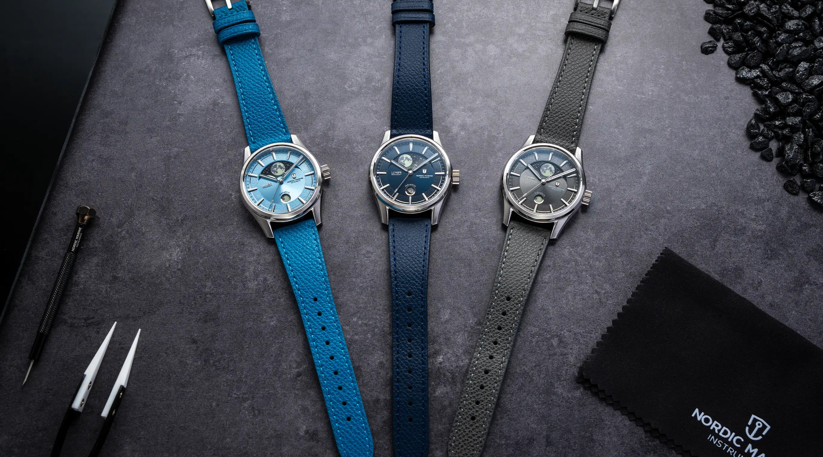
Three dials. One sky.
We chose three dial colours: Atlantic Blue, Sky Blue, and Shore Grey. Each one represents a different moment of the Nordic night.
Atlantic Blue is the open sea at 2am: deep, calm, with no horizon visible.

Sky Blue is the half-hour before true darkness, when the light hasn't quite left.

Shore Grey is water splashing on the rocks on the shores and cliffs: elegant, cool, and versatile. They are not just colorways. They are moods. And each one changes how the aurora reads against the dial.
What we learned
Building LUNØR taught us that a complication is most powerful when it tells a story, not just the time. Every element, the aurora, the Måneblik, the BGW9 hands, the sunburst dial, exists in service of a single idea: the Nordic night is worth looking at carefully.
We hope LUNØR makes you see the beauty of the Nordic night.
— Christopher & the NMI crew