When I first encountered NMI, it was because of their Nordhavnen watch model.
What attracted me to that model was the unique bezel, being all black showing only an inverted triangle to mark a point on the bezel. Sadly, that watch did not come into being for the general public, instead, the Østersøen came along, and I am glad that it did. And then came the SØVÆRN.
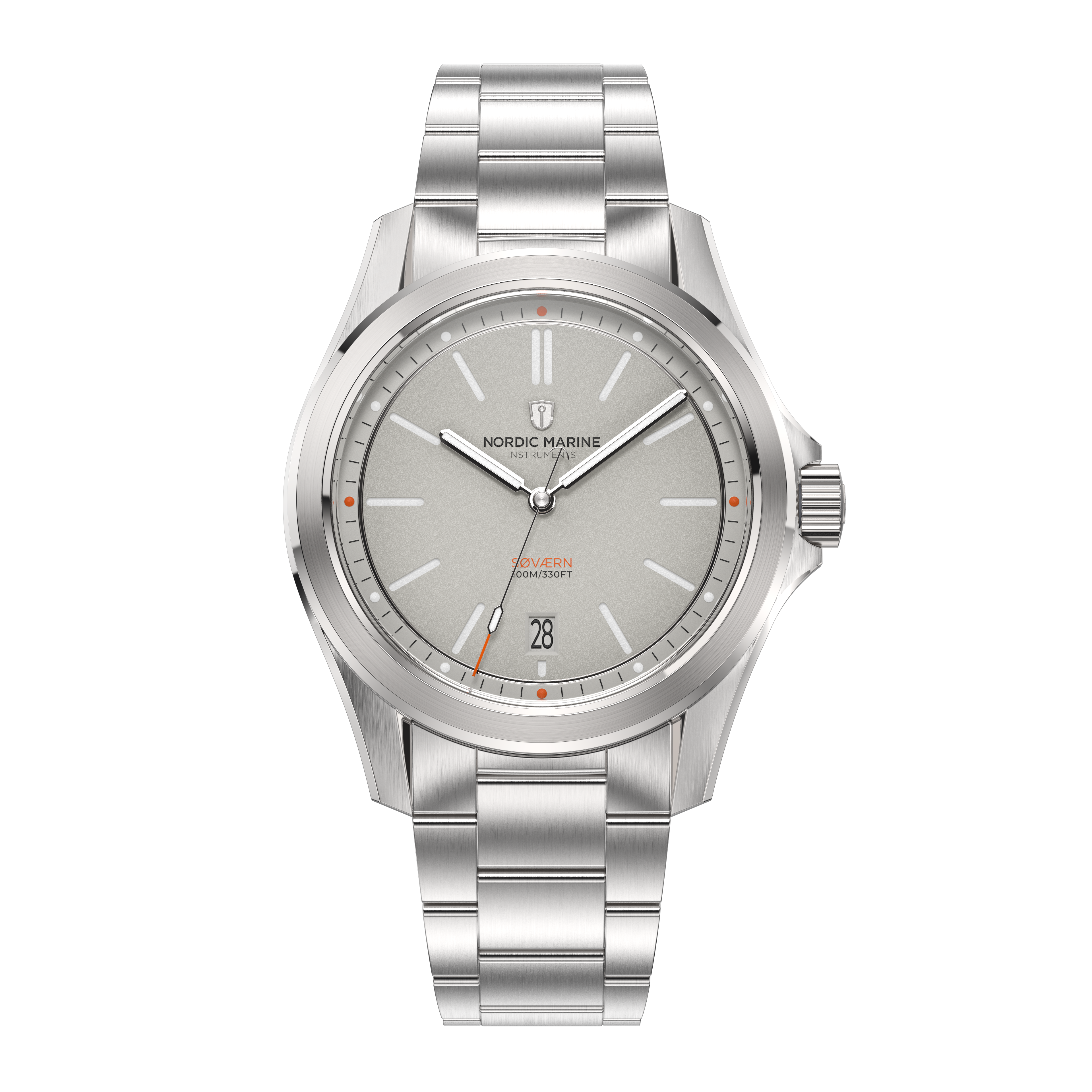
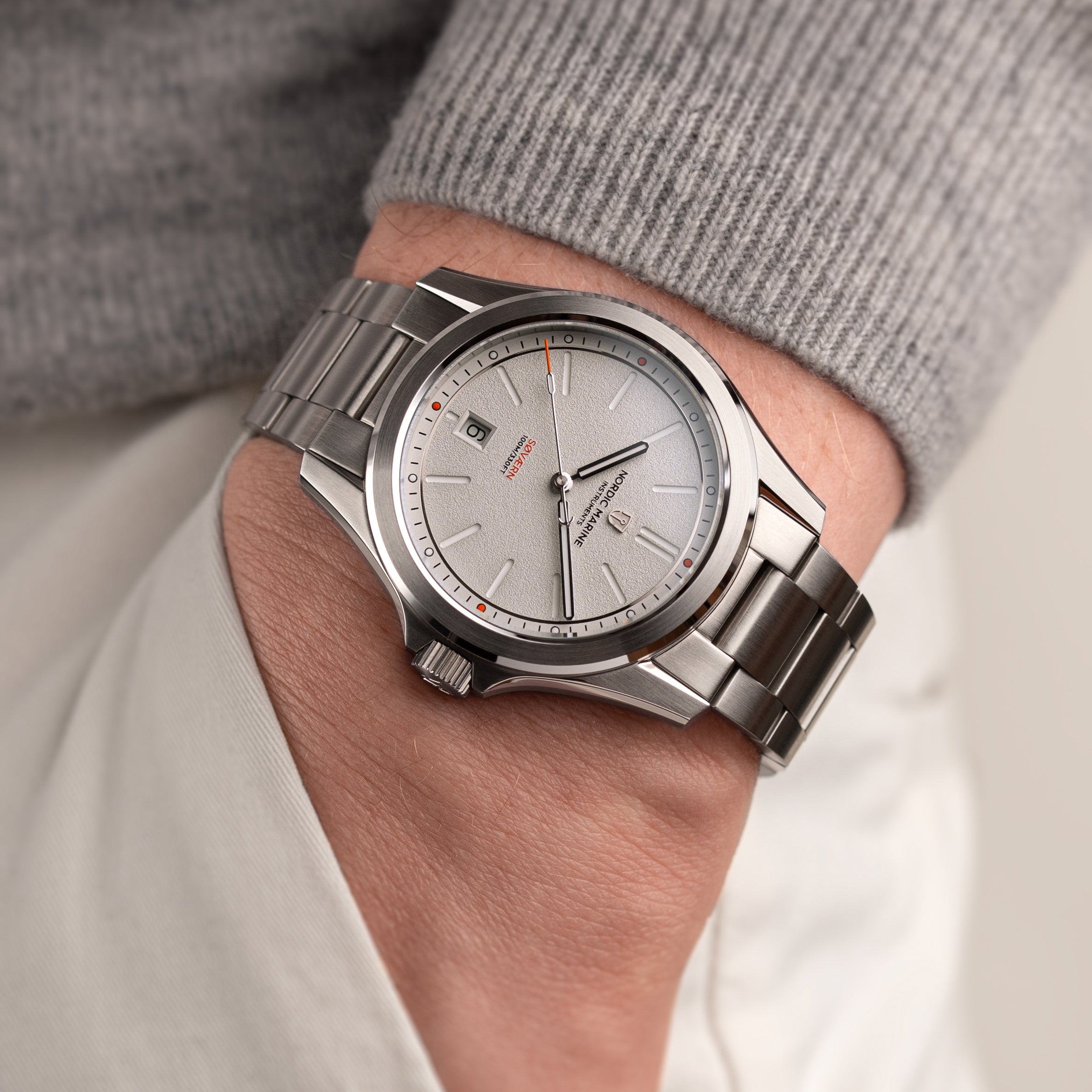
I like both watch families as I think the watch case is very well done, and somewhat different from the others. Its polished chamfers are wider than most other watches that I have, and what I like about the chamfers too is how they do it on the crown side, where the polished chamfers thin out towards the crown guard instead of the polish going over the hop of the crown guard. The profile of the case is also somewhat unique in that there is a very gentle curve of the watch downwards as you move from the centre towards the lugs. Ok, all watches ultimately curve downwards towards the lugs - but most are more abrupt or the curvature is not as evident - nothing wrong with these other forms, but because of the wider chamfer on the Østersøen/SØVÆRN, the polish is more evident and somehow it highlights more the gentle curvature of the watch with the sleek brushed portion between the upper and lower chamfers when viewed from the side. Christopher Ward has a similar chamfer/polish profile for its "light-catcher case" with slightly slimmer chamfers. I find this approach to the case make its very enjoyable to look at it as it plays beautifully with the light at various angles when viewed for time-reading.
Besides the case, the dial is really very nicely done for the Stålgrå/SØVÆRN series. The fine grain finishing on the dial gives it a unique look, and plays beautifully with the light when viewing the watch in different lighting conditions as the shadows cast by the fine grain variations ("mountains and valleys") on the dial contrast with the lighted sides giving it a unique look rather than the usual matt/gloss or sunburst style dials. The unique thing about the Stålgrå's grey/silver coloured dial is that it seems to be bit of a chameleon - I put green suede straps on the watch, and after a while, there seemed to be a very light greenish tinge to the dial. I wonder if other coloured straps might create similar visual colour effects.
The hands are ideal for this field watch concept, and I like the seconds hand here better than in the Østersøen as it seems more balanced in terms of the size at the head (where the luminous bit is) and the anchor tail. With the Østersøen, I felt that the head of the seconds hand was a little larger, perceptionally, relative to the anchor tail, making it look a little odd with such a large head on the long side of the seconds hand and the smaller anchor counter-weight on the short side. In the SØVÆRN series, the seconds hand is well-balanced/perfect.
What I like about the dial as well is the little colour accents - the orange (vermillion?)-coloured tip of the second hand, quarter hour markers on the outer rail, and text for the name of the watch. Adding a little bit of colour contrast tastefully makes a huge difference to the presentation of the dial, and the watch as a whole. Having a colour-matched date disk certainly helps as well as it blends in the whole picture of the dial.
I also like the quick change bracelet strap - very comfortable. As I normally like to wear my watch with a little slack rather than just snug, the little knobs that stick out ever so slightly for the quick change functionality does not bother me at all, and I really like having that functionality as I sometimes like to be able to switch my straps on a whim.
One more thing about the SØVÆRN watch (also the same for the Østersøen series) that I like is the crown. It has a good with to it, which makes it easy to grip manipulate; probably close the ideal size for me for 39mm case that is this slim.
For whomever is thinking of picking up a SØVÆRN watch, you can't really go wrong with any colour scheme - except maybe the black in the sense that the grain finish/light contrast does not come out as strongly or evidently as the other lighter coloured dials. Still, the black dial, especially the Kulsort, is works well with the light yellow-ish orange indices and red colour accents - but, that is for another review. For the Stålgrå, it's grey/silver dial works well, and is great for a GADA or even the more formal wear and events. There is no legibility issue with the hands and the dial colour given the grey tinge to the dial.
Am very happy with my purchase. Thinking of possibly one more - the Mosgrøn. :-)
